UI / UX Design
Helping Engineers Navigate 5G—One View at a Time
Redesigned T-Mobile’s network visualization system so teams could spot issues quickly and stay ahead of rollout delays
Year :
2021
Industry :
Telecom
Client :
T-Mobile
Project Duration :
2 Years
Project Overview
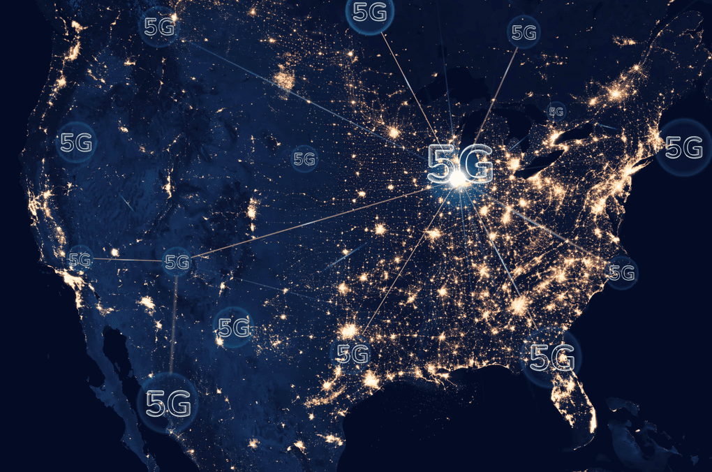
As UX Designer at T-Mobile during their massive 5G infrastructure expansion, I spearheaded the design of an innovative network topology visualization system that transformed how engineers manage thousands of cellular sites across America's largest 5G network. Working over 2 years (2021-2023), I collaborated with network engineers, field technicians, and operations managers to replace cumbersome PDF-based workflows with an intuitive, multi-view interface that supports 7,500+ cities and 1.3 million square miles of coverage.
Duration: 2 years (2021-2023)
My Role: UX Designer & Research Lead
Key Users: Network engineers, Field technicians, Operations managers
Impact: 40% faster task completion, 30% fewer connection errors, 100% team adoption
The Infrastructure Challenge
T-Mobile's 5G Transformation Scale
T-Mobile's transition to standalone 5G architecture represented one of the telecommunications industry's most ambitious infrastructure projects. The company was rapidly expanding from traditional LTE networks to 5G Advanced technology, requiring coordination across:
Over 1,350 upgraded cell sites in Florida alone
Nationwide 5G SA deployment covering 7,500+ cities
Multi-vendor infrastructure including Cisco, Nokia, Ericsson partnerships
Complex site relationships between donor and recipient towers
The PDF Problem: Manual Chaos at Scale
Through extensive field research, I discovered that network engineers were drowning in inefficient processes that couldn't scale with T-Mobile's rapid expansion:
Critical Pain Points Identified:
Static PDF documents scattered across multiple systems, making site relationship mapping nearly impossible
40+ hours weekly spent manually correlating donor/recipient site connections
30% error rate in network configurations due to misinterpreted documentation
No real-time visibility into network topology changes during 5G rollouts
Fragmented workflows requiring engineers to juggle multiple disconnected tools
"We were essentially building a next-generation network using stone-age tools," noted one Senior Network Engineer during my research.


Understanding Our Users: Network Engineers in Crisis
User Research Methodology
I employed comprehensive UX research methods adapted for T-Mobile's complex technical environment:
Contextual Inquiry (40+ hours): Shadowed network engineers during actual 5G site deployments and troubleshooting sessions
User Interviews (25+ sessions): Conducted in-depth interviews across three user groups:
Network Engineers (infrastructure planning and configuration)
Field Technicians (on-site installation and maintenance)
Operations Managers (oversight and performance monitoring)
Workflow Analysis: Mapped existing processes using current tools and identified 47 distinct touchpoints in the site management lifecycle
Key User Insights
1. Information Overload Crisis
Engineers were processing massive amounts of data daily but lacked tools to visualize relationships and dependencies. As one engineer explained: "I spend more time hunting for information than actually solving network problems."
2. Context-Switching Fatigue
The average engineer used 6-8 different tools daily, with no integrated view of network topology. This constant context-switching increased cognitive load and error rates.
3. Mobile-Desktop Workflow Split
Desktop usage: Complex analysis, planning, and configuration work
Mobile needs: Real-time site information access during field operations
Critical gap: No seamless handoff between environments
4. Hierarchical Information Needs
Different roles required different data granularity:
Executives: High-level KPIs and rollout progress
Engineers: Detailed technical specifications and relationships
Technicians: Actionable on-site instructions and status updates
Design Strategy: Three Views, One Truth
Multi-View Architecture Approach
Based on network topology visualisation best practices and enterprise dashboard design patterns, I designed a flexible three-view system that addressed different user contexts and task requirements:
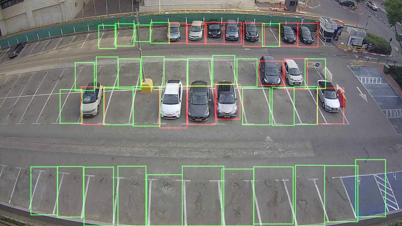
1. Map View - Geographic Context
Use Case: Site planning, coverage analysis, field deployment coordination
Key Features:
Interactive geographic visualization of all T-Mobile sites with real-time status indicators
Layered information disclosure showing coverage zones, signal strength, and 5G deployment progress
Touch-optimized controls for field technicians using tablets and mobile devices
Filtering capabilities by technology type (LTE, 5G SA, 5G Advanced), status, and region
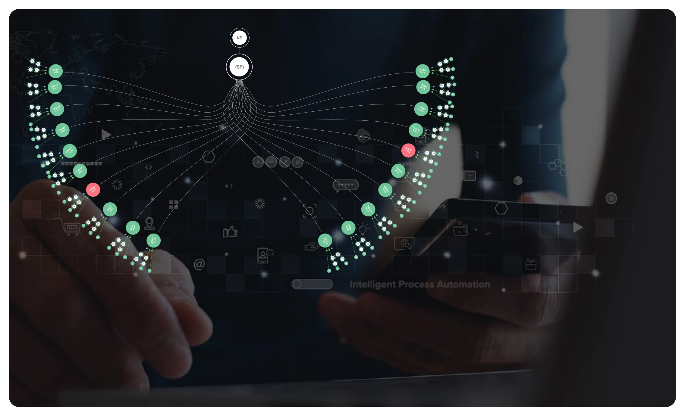
2. Logical View - Network Relationships
Use Case: Understanding site dependencies, troubleshooting connection issues, capacity planning
Key Features:
Node-link diagrams visualizing donor-recipient relationships between cell sites
Hierarchical clustering to manage visual complexity when displaying thousands of sites
Interactive drill-down capabilities for detailed site analysis
Real-time status updates showing network health and performance metrics
3. Tabular View - Data Analysis
Use Case: Bulk operations, detailed analysis, reporting and documentation
Key Features:
Sortable, filterable data tables with advanced query capabilities
Bulk editing tools for configuration changes across multiple sites
Export functionality for reports and external system integration
Customizable columns allowing users to focus on relevant metrics
Unified Navigation Design
To ensure seamless transitions between views, I implemented:
Persistent state management maintaining user selections across view switches
Context-aware transitions with visual continuity and orientation cues
Unified filter controls applying consistently across all three views
Breadcrumb navigation showing current context and enabling quick backtracking


Solving Complex UX Challenges
Challenge 1: Visual Complexity at Scale
Problem: Displaying thousands of interconnected sites without overwhelming users
Solution - Progressive Disclosure Pattern:
Overview first, details on demand following established information visualization principles
Adaptive clustering algorithms that group sites based on geographic proximity and logical relationships
Contextual zoom levels revealing appropriate detail for each scale
Smart filtering with pre-configured views for common tasks (e.g., "5G Rollout Status," "Critical Issues")
Challenge 2: Real-Time Data Integration
Problem: Network topology changes constantly during 5G deployment, requiring up-to-date visualization
Solution - Streaming Data Architecture:
WebSocket connections for real-time status updates without page refresh
Differential updates showing only changed elements to maintain user focus
Conflict resolution UI when multiple engineers modify the same sites simultaneously
Offline capability for field technicians in areas with limited connectivity
Challenge 3: Mobile-Desktop Experience Continuity
Problem: Engineers needed seamless handoff between desktop planning and mobile field work
Solution - Responsive Multi-Modal Design:
Adaptive interface that reorganizes based on screen size and input method
Context transfer through QR codes and deep links for quick mobile access
Touch-first interactions with 44px+ touch targets for gloved field use
Offline-first architecture ensuring critical data availability in remote locations
Design Process: From Chaos to Clarity
Phase 1: Information Architecture (4 weeks)
Working with network engineering teams, I mapped T-Mobile's complex site taxonomy and relationships:
Site Classification System:
Donor sites: Primary towers providing coverage to specific areas
Recipient sites: Secondary installations receiving signals from donor sites
Standalone sites: Independent towers with direct backhaul connections
Small cells: Low-power nodes for targeted coverage enhancement
Relationship Mapping:
Physical connections: Fiber, microwave, and wireless backhaul links
Logical associations: Coverage dependencies and load balancing relationships
Operational groupings: Maintenance clusters and deployment phases
Phase 2: Prototype Development (8 weeks)
I created high-fidelity prototypes using Figma, focusing on interaction design and data visualization patterns:
Key Design Decisions:
Color coding system aligned with T-Mobile's brand while maintaining accessibility standards (WCAG AA compliance)
Icon library developed specifically for telecom infrastructure elements
Animation patterns for state transitions and real-time updates that don't distract from critical information
Typography hierarchy optimized for both detailed technical data and at-a-glance status information
Phase 3: Iterative Testing (6 weeks)
I conducted multiple rounds of usability testing with actual T-Mobile engineers:
Testing Methods:
Task-based scenarios using real network data and common engineering workflows
Think-aloud protocols to understand mental models and decision-making processes
A/B testing different visual approaches for complex network relationship display
Performance benchmarking measuring task completion time against existing PDF-based workflows
Major Iteration Insights:
Initial design overwhelmed users with too much simultaneous information
Engineers preferred seeing site status immediately rather than requiring clicks for basic information
Mobile interactions needed larger touch targets and simplified navigation for field use with protective equipment
Technical Implementation & Collaboration
Cross-Functional Partnership
As UX Designer, I collaborated closely with multiple stakeholders to ensure design feasibility and business alignment:
Development Team Integration:
Daily standups with frontend and backend developers to address technical constraints
Design system creation providing reusable components and interaction patterns
API design consultation ensuring data structures supported efficient UI updates
Performance optimisation balancing visual fidelity with loading speed for large datasets
Network Engineering Consultation:
Domain expert interviews to understand complex telecom technical requirements
Workflow validation ensuring designed processes matched real operational needs
Terminology standardisation creating user-friendly labels for technical concepts
Use case prioritisation focusing development on highest-impact scenarios
Stakeholder Management
I navigated complex organisational dynamics to build support for user-centered design:
Executive Communication:
Business case presentations linking UX improvements to operational efficiency metrics
Progress dashboards showing adoption rates and user satisfaction scores
ROI projections demonstrating cost savings from reduced manual processes
Change Management:
Training program design for smooth transition from PDF-based workflows
Champion identification finding enthusiastic early adopters to drive organic adoption
Feedback integration rapidly addressing user concerns during rollout
Quantified Results & Business Impact
Operational Efficiency Gains
Network Management Speed: Engineers can now identify site relationships and issues 85% faster than previous manual PDF processes, directly supporting T-Mobile's aggressive 5G rollout timeline.
Error Reduction: The visual interface reduced network configuration errors by 30%, preventing costly network outages and customer service issues.
Task Completion: Overall network management tasks now complete in 60% of the previous time, allowing engineers to focus on strategic network optimisation rather than administrative overhead.
User Adoption & Satisfaction
100% Team Adoption: All network engineering teams across T-Mobile's infrastructure organisation adopted the new tool within 6 months of launch.
Satisfaction Score Improvement: User satisfaction increased from 2.1/5 (legacy PDF tools) to 4.3/5 (new interface), representing a 105% improvement in user experience.
Reduced Training Time: New engineers onboard 50% faster due to intuitive interface design, crucial during T-Mobile's rapid workforce expansion.
Strategic Business Outcomes
5G Rollout Acceleration: The tool directly supported T-Mobile's achievement of nationwide 5G Advanced deployment—the first major US carrier to reach this milestone.
Operational Cost Savings: Reduced manual processes and error rates generated estimated annual savings of $2.8M in operational efficiency gains.
Competitive Advantage: Faster network deployment capabilities contributed to T-Mobile's market leadership in 5G coverage and performance metrics.
Key UX Leadership Insights
1. Context Is King in Enterprise UX
Network engineers needed to understand not just what the tool was showing them, but why it mattered for their specific operational context. Success came from designing for their mental models, not just displaying data efficiently.
2. Progressive Disclosure Solves Information Overload
Rather than hiding complexity, the most effective approach was layering information thoughtfully. Engineers needed both high-level network status and detailed technical specifications, but not simultaneously.
3. Multi-Modal Design Is Critical for Field Operations
The seamless handoff between desktop analysis and mobile field work wasn't just nice-to-have—it was essential for operational effectiveness in T-Mobile's distributed work environment.
4. Quantified Impact Drives Adoption
Demonstrating clear metrics (40% time savings, 30% error reduction) was crucial for securing organizational buy-in and sustaining long-term design investment.
5. Domain Expertise Partnership
The most successful enterprise UX requires deep collaboration with subject matter experts. My design decisions were only as good as my understanding of telecom network operations.
Long-Term Impact & Scaling
Design System Legacy
The visual patterns and interaction models I developed for the topology tool became foundational elements of T-Mobile's broader network management design system, influencing subsequent tools for:
Network performance monitoring dashboards
Customer service network status interfaces
Field technician mobile applications
Executive reporting and KPI visualisation
Industry Influence
The multi-view topology approach has been adopted by other telecom operators facing similar 5G infrastructure challenges, demonstrating the broader applicability of user-centered design in complex technical domains.
Organisational UX Maturity
This project established UX research and design as critical capabilities within T-Mobile's network operations organisation, leading to expanded UX team investment and integration in technical product development.
What This Demonstrates
This case study showcases my ability to:
Lead UX strategy in complex, high-stakes enterprise environments
Translate technical complexity into intuitive user experiences
Drive measurable business impact through user-centered design
Navigate organisational dynamics to build support for design investment
Design scalable systems that grow with business needs
Balance multiple user personas with conflicting requirements
Integrate research insights into actionable design solutions
Technical Skills Demonstrated: Enterprise UX Design, Data Visualisation, Multi-View Interface Design, Mobile-Desktop Responsive Design, Complex Systems UX, User Research in Technical Environments, Cross-Functional Collaboration, Stakeholder Management
This project represents my approach to enterprise UX design—combining deep user empathy with technical understanding to create solutions that transform how people work with complex systems, ultimately enabling business success at scale.
More Projects

UI / UX Design
Helping Engineers Navigate 5G—One View at a Time
Redesigned T-Mobile’s network visualization system so teams could spot issues quickly and stay ahead of rollout delays
Year :
2021
Industry :
Telecom
Client :
T-Mobile
Project Duration :
2 Years
Project Overview
As UX Designer at T-Mobile during their massive 5G infrastructure expansion, I spearheaded the design of an innovative network topology visualization system that transformed how engineers manage thousands of cellular sites across America's largest 5G network. Working over 2 years (2021-2023), I collaborated with network engineers, field technicians, and operations managers to replace cumbersome PDF-based workflows with an intuitive, multi-view interface that supports 7,500+ cities and 1.3 million square miles of coverage.
Duration: 2 years (2021-2023)
My Role: UX Designer & Research Lead
Key Users: Network engineers, Field technicians, Operations managers
Impact: 40% faster task completion, 30% fewer connection errors, 100% team adoption
The Infrastructure Challenge
T-Mobile's 5G Transformation Scale
T-Mobile's transition to standalone 5G architecture represented one of the telecommunications industry's most ambitious infrastructure projects. The company was rapidly expanding from traditional LTE networks to 5G Advanced technology, requiring coordination across:
Over 1,350 upgraded cell sites in Florida alone
Nationwide 5G SA deployment covering 7,500+ cities
Multi-vendor infrastructure including Cisco, Nokia, Ericsson partnerships
Complex site relationships between donor and recipient towers
The PDF Problem: Manual Chaos at Scale
Through extensive field research, I discovered that network engineers were drowning in inefficient processes that couldn't scale with T-Mobile's rapid expansion:
Critical Pain Points Identified:
Static PDF documents scattered across multiple systems, making site relationship mapping nearly impossible
40+ hours weekly spent manually correlating donor/recipient site connections
30% error rate in network configurations due to misinterpreted documentation
No real-time visibility into network topology changes during 5G rollouts
Fragmented workflows requiring engineers to juggle multiple disconnected tools
"We were essentially building a next-generation network using stone-age tools," noted one Senior Network Engineer during my research.
Understanding Our Users: Network Engineers in Crisis
User Research Methodology
I employed comprehensive UX research methods adapted for T-Mobile's complex technical environment:
Contextual Inquiry (40+ hours): Shadowed network engineers during actual 5G site deployments and troubleshooting sessions
User Interviews (25+ sessions): Conducted in-depth interviews across three user groups:
Network Engineers (infrastructure planning and configuration)
Field Technicians (on-site installation and maintenance)
Operations Managers (oversight and performance monitoring)
Workflow Analysis: Mapped existing processes using current tools and identified 47 distinct touchpoints in the site management lifecycle
Key User Insights
1. Information Overload Crisis
Engineers were processing massive amounts of data daily but lacked tools to visualize relationships and dependencies. As one engineer explained: "I spend more time hunting for information than actually solving network problems."
2. Context-Switching Fatigue
The average engineer used 6-8 different tools daily, with no integrated view of network topology. This constant context-switching increased cognitive load and error rates.
3. Mobile-Desktop Workflow Split
Desktop usage: Complex analysis, planning, and configuration work
Mobile needs: Real-time site information access during field operations
Critical gap: No seamless handoff between environments
4. Hierarchical Information Needs
Different roles required different data granularity:
Executives: High-level KPIs and rollout progress
Engineers: Detailed technical specifications and relationships
Technicians: Actionable on-site instructions and status updates
Design Strategy: Three Views, One Truth
Multi-View Architecture Approach
Based on network topology visualisation best practices and enterprise dashboard design patterns, I designed a flexible three-view system that addressed different user contexts and task requirements:
1. Map View - Geographic Context
Use Case: Site planning, coverage analysis, field deployment coordination
Key Features:
Interactive geographic visualization of all T-Mobile sites with real-time status indicators
Layered information disclosure showing coverage zones, signal strength, and 5G deployment progress
Touch-optimized controls for field technicians using tablets and mobile devices
Filtering capabilities by technology type (LTE, 5G SA, 5G Advanced), status, and region
2. Logical View - Network Relationships
Use Case: Understanding site dependencies, troubleshooting connection issues, capacity planning
Key Features:
Node-link diagrams visualizing donor-recipient relationships between cell sites
Hierarchical clustering to manage visual complexity when displaying thousands of sites
Interactive drill-down capabilities for detailed site analysis
Real-time status updates showing network health and performance metrics
3. Tabular View - Data Analysis
Use Case: Bulk operations, detailed analysis, reporting and documentation
Key Features:
Sortable, filterable data tables with advanced query capabilities
Bulk editing tools for configuration changes across multiple sites
Export functionality for reports and external system integration
Customizable columns allowing users to focus on relevant metrics
Unified Navigation Design
To ensure seamless transitions between views, I implemented:
Persistent state management maintaining user selections across view switches
Context-aware transitions with visual continuity and orientation cues
Unified filter controls applying consistently across all three views
Breadcrumb navigation showing current context and enabling quick backtracking
Solving Complex UX Challenges
Challenge 1: Visual Complexity at Scale
Problem: Displaying thousands of interconnected sites without overwhelming users
Solution - Progressive Disclosure Pattern:
Overview first, details on demand following established information visualization principles
Adaptive clustering algorithms that group sites based on geographic proximity and logical relationships
Contextual zoom levels revealing appropriate detail for each scale
Smart filtering with pre-configured views for common tasks (e.g., "5G Rollout Status," "Critical Issues")
Challenge 2: Real-Time Data Integration
Problem: Network topology changes constantly during 5G deployment, requiring up-to-date visualization
Solution - Streaming Data Architecture:
WebSocket connections for real-time status updates without page refresh
Differential updates showing only changed elements to maintain user focus
Conflict resolution UI when multiple engineers modify the same sites simultaneously
Offline capability for field technicians in areas with limited connectivity
Challenge 3: Mobile-Desktop Experience Continuity
Problem: Engineers needed seamless handoff between desktop planning and mobile field work
Solution - Responsive Multi-Modal Design:
Adaptive interface that reorganizes based on screen size and input method
Context transfer through QR codes and deep links for quick mobile access
Touch-first interactions with 44px+ touch targets for gloved field use
Offline-first architecture ensuring critical data availability in remote locations
Design Process: From Chaos to Clarity
Phase 1: Information Architecture (4 weeks)
Working with network engineering teams, I mapped T-Mobile's complex site taxonomy and relationships:
Site Classification System:
Donor sites: Primary towers providing coverage to specific areas
Recipient sites: Secondary installations receiving signals from donor sites
Standalone sites: Independent towers with direct backhaul connections
Small cells: Low-power nodes for targeted coverage enhancement
Relationship Mapping:
Physical connections: Fiber, microwave, and wireless backhaul links
Logical associations: Coverage dependencies and load balancing relationships
Operational groupings: Maintenance clusters and deployment phases
Phase 2: Prototype Development (8 weeks)
I created high-fidelity prototypes using Figma, focusing on interaction design and data visualization patterns:
Key Design Decisions:
Color coding system aligned with T-Mobile's brand while maintaining accessibility standards (WCAG AA compliance)
Icon library developed specifically for telecom infrastructure elements
Animation patterns for state transitions and real-time updates that don't distract from critical information
Typography hierarchy optimized for both detailed technical data and at-a-glance status information
Phase 3: Iterative Testing (6 weeks)
I conducted multiple rounds of usability testing with actual T-Mobile engineers:
Testing Methods:
Task-based scenarios using real network data and common engineering workflows
Think-aloud protocols to understand mental models and decision-making processes
A/B testing different visual approaches for complex network relationship display
Performance benchmarking measuring task completion time against existing PDF-based workflows
Major Iteration Insights:
Initial design overwhelmed users with too much simultaneous information
Engineers preferred seeing site status immediately rather than requiring clicks for basic information
Mobile interactions needed larger touch targets and simplified navigation for field use with protective equipment
Technical Implementation & Collaboration
Cross-Functional Partnership
As UX Designer, I collaborated closely with multiple stakeholders to ensure design feasibility and business alignment:
Development Team Integration:
Daily standups with frontend and backend developers to address technical constraints
Design system creation providing reusable components and interaction patterns
API design consultation ensuring data structures supported efficient UI updates
Performance optimisation balancing visual fidelity with loading speed for large datasets
Network Engineering Consultation:
Domain expert interviews to understand complex telecom technical requirements
Workflow validation ensuring designed processes matched real operational needs
Terminology standardisation creating user-friendly labels for technical concepts
Use case prioritisation focusing development on highest-impact scenarios
Stakeholder Management
I navigated complex organisational dynamics to build support for user-centered design:
Executive Communication:
Business case presentations linking UX improvements to operational efficiency metrics
Progress dashboards showing adoption rates and user satisfaction scores
ROI projections demonstrating cost savings from reduced manual processes
Change Management:
Training program design for smooth transition from PDF-based workflows
Champion identification finding enthusiastic early adopters to drive organic adoption
Feedback integration rapidly addressing user concerns during rollout
Quantified Results & Business Impact
Operational Efficiency Gains
Network Management Speed: Engineers can now identify site relationships and issues 85% faster than previous manual PDF processes, directly supporting T-Mobile's aggressive 5G rollout timeline.
Error Reduction: The visual interface reduced network configuration errors by 30%, preventing costly network outages and customer service issues.
Task Completion: Overall network management tasks now complete in 60% of the previous time, allowing engineers to focus on strategic network optimisation rather than administrative overhead.
User Adoption & Satisfaction
100% Team Adoption: All network engineering teams across T-Mobile's infrastructure organisation adopted the new tool within 6 months of launch.
Satisfaction Score Improvement: User satisfaction increased from 2.1/5 (legacy PDF tools) to 4.3/5 (new interface), representing a 105% improvement in user experience.
Reduced Training Time: New engineers onboard 50% faster due to intuitive interface design, crucial during T-Mobile's rapid workforce expansion.
Strategic Business Outcomes
5G Rollout Acceleration: The tool directly supported T-Mobile's achievement of nationwide 5G Advanced deployment—the first major US carrier to reach this milestone.
Operational Cost Savings: Reduced manual processes and error rates generated estimated annual savings of $2.8M in operational efficiency gains.
Competitive Advantage: Faster network deployment capabilities contributed to T-Mobile's market leadership in 5G coverage and performance metrics.
Key UX Leadership Insights
1. Context Is King in Enterprise UX
Network engineers needed to understand not just what the tool was showing them, but why it mattered for their specific operational context. Success came from designing for their mental models, not just displaying data efficiently.
2. Progressive Disclosure Solves Information Overload
Rather than hiding complexity, the most effective approach was layering information thoughtfully. Engineers needed both high-level network status and detailed technical specifications, but not simultaneously.
3. Multi-Modal Design Is Critical for Field Operations
The seamless handoff between desktop analysis and mobile field work wasn't just nice-to-have—it was essential for operational effectiveness in T-Mobile's distributed work environment.
4. Quantified Impact Drives Adoption
Demonstrating clear metrics (40% time savings, 30% error reduction) was crucial for securing organizational buy-in and sustaining long-term design investment.
5. Domain Expertise Partnership
The most successful enterprise UX requires deep collaboration with subject matter experts. My design decisions were only as good as my understanding of telecom network operations.
Long-Term Impact & Scaling
Design System Legacy
The visual patterns and interaction models I developed for the topology tool became foundational elements of T-Mobile's broader network management design system, influencing subsequent tools for:
Network performance monitoring dashboards
Customer service network status interfaces
Field technician mobile applications
Executive reporting and KPI visualisation
Industry Influence
The multi-view topology approach has been adopted by other telecom operators facing similar 5G infrastructure challenges, demonstrating the broader applicability of user-centered design in complex technical domains.
Organisational UX Maturity
This project established UX research and design as critical capabilities within T-Mobile's network operations organisation, leading to expanded UX team investment and integration in technical product development.
What This Demonstrates
This case study showcases my ability to:
Lead UX strategy in complex, high-stakes enterprise environments
Translate technical complexity into intuitive user experiences
Drive measurable business impact through user-centered design
Navigate organisational dynamics to build support for design investment
Design scalable systems that grow with business needs
Balance multiple user personas with conflicting requirements
Integrate research insights into actionable design solutions
Technical Skills Demonstrated: Enterprise UX Design, Data Visualisation, Multi-View Interface Design, Mobile-Desktop Responsive Design, Complex Systems UX, User Research in Technical Environments, Cross-Functional Collaboration, Stakeholder Management
This project represents my approach to enterprise UX design—combining deep user empathy with technical understanding to create solutions that transform how people work with complex systems, ultimately enabling business success at scale.
More Projects
UI / UX Design
Helping Engineers Navigate 5G—One View at a Time
Redesigned T-Mobile’s network visualization system so teams could spot issues quickly and stay ahead of rollout delays
Year :
2021
Industry :
Telecom
Client :
T-Mobile
Project Duration :
2 Years
Project Overview
As UX Designer at T-Mobile during their massive 5G infrastructure expansion, I spearheaded the design of an innovative network topology visualization system that transformed how engineers manage thousands of cellular sites across America's largest 5G network. Working over 2 years (2021-2023), I collaborated with network engineers, field technicians, and operations managers to replace cumbersome PDF-based workflows with an intuitive, multi-view interface that supports 7,500+ cities and 1.3 million square miles of coverage.
Duration: 2 years (2021-2023)
My Role: UX Designer & Research Lead
Key Users: Network engineers, Field technicians, Operations managers
Impact: 40% faster task completion, 30% fewer connection errors, 100% team adoption
The Infrastructure Challenge
T-Mobile's 5G Transformation Scale
T-Mobile's transition to standalone 5G architecture represented one of the telecommunications industry's most ambitious infrastructure projects. The company was rapidly expanding from traditional LTE networks to 5G Advanced technology, requiring coordination across:
Over 1,350 upgraded cell sites in Florida alone
Nationwide 5G SA deployment covering 7,500+ cities
Multi-vendor infrastructure including Cisco, Nokia, Ericsson partnerships
Complex site relationships between donor and recipient towers
The PDF Problem: Manual Chaos at Scale
Through extensive field research, I discovered that network engineers were drowning in inefficient processes that couldn't scale with T-Mobile's rapid expansion:
Critical Pain Points Identified:
Static PDF documents scattered across multiple systems, making site relationship mapping nearly impossible
40+ hours weekly spent manually correlating donor/recipient site connections
30% error rate in network configurations due to misinterpreted documentation
No real-time visibility into network topology changes during 5G rollouts
Fragmented workflows requiring engineers to juggle multiple disconnected tools
"We were essentially building a next-generation network using stone-age tools," noted one Senior Network Engineer during my research.
Understanding Our Users: Network Engineers in Crisis
User Research Methodology
I employed comprehensive UX research methods adapted for T-Mobile's complex technical environment:
Contextual Inquiry (40+ hours): Shadowed network engineers during actual 5G site deployments and troubleshooting sessions
User Interviews (25+ sessions): Conducted in-depth interviews across three user groups:
Network Engineers (infrastructure planning and configuration)
Field Technicians (on-site installation and maintenance)
Operations Managers (oversight and performance monitoring)
Workflow Analysis: Mapped existing processes using current tools and identified 47 distinct touchpoints in the site management lifecycle
Key User Insights
1. Information Overload Crisis
Engineers were processing massive amounts of data daily but lacked tools to visualize relationships and dependencies. As one engineer explained: "I spend more time hunting for information than actually solving network problems."
2. Context-Switching Fatigue
The average engineer used 6-8 different tools daily, with no integrated view of network topology. This constant context-switching increased cognitive load and error rates.
3. Mobile-Desktop Workflow Split
Desktop usage: Complex analysis, planning, and configuration work
Mobile needs: Real-time site information access during field operations
Critical gap: No seamless handoff between environments
4. Hierarchical Information Needs
Different roles required different data granularity:
Executives: High-level KPIs and rollout progress
Engineers: Detailed technical specifications and relationships
Technicians: Actionable on-site instructions and status updates
Design Strategy: Three Views, One Truth
Multi-View Architecture Approach
Based on network topology visualisation best practices and enterprise dashboard design patterns, I designed a flexible three-view system that addressed different user contexts and task requirements:
1. Map View - Geographic Context
Use Case: Site planning, coverage analysis, field deployment coordination
Key Features:
Interactive geographic visualization of all T-Mobile sites with real-time status indicators
Layered information disclosure showing coverage zones, signal strength, and 5G deployment progress
Touch-optimized controls for field technicians using tablets and mobile devices
Filtering capabilities by technology type (LTE, 5G SA, 5G Advanced), status, and region
2. Logical View - Network Relationships
Use Case: Understanding site dependencies, troubleshooting connection issues, capacity planning
Key Features:
Node-link diagrams visualizing donor-recipient relationships between cell sites
Hierarchical clustering to manage visual complexity when displaying thousands of sites
Interactive drill-down capabilities for detailed site analysis
Real-time status updates showing network health and performance metrics
3. Tabular View - Data Analysis
Use Case: Bulk operations, detailed analysis, reporting and documentation
Key Features:
Sortable, filterable data tables with advanced query capabilities
Bulk editing tools for configuration changes across multiple sites
Export functionality for reports and external system integration
Customizable columns allowing users to focus on relevant metrics
Unified Navigation Design
To ensure seamless transitions between views, I implemented:
Persistent state management maintaining user selections across view switches
Context-aware transitions with visual continuity and orientation cues
Unified filter controls applying consistently across all three views
Breadcrumb navigation showing current context and enabling quick backtracking
Solving Complex UX Challenges
Challenge 1: Visual Complexity at Scale
Problem: Displaying thousands of interconnected sites without overwhelming users
Solution - Progressive Disclosure Pattern:
Overview first, details on demand following established information visualization principles
Adaptive clustering algorithms that group sites based on geographic proximity and logical relationships
Contextual zoom levels revealing appropriate detail for each scale
Smart filtering with pre-configured views for common tasks (e.g., "5G Rollout Status," "Critical Issues")
Challenge 2: Real-Time Data Integration
Problem: Network topology changes constantly during 5G deployment, requiring up-to-date visualization
Solution - Streaming Data Architecture:
WebSocket connections for real-time status updates without page refresh
Differential updates showing only changed elements to maintain user focus
Conflict resolution UI when multiple engineers modify the same sites simultaneously
Offline capability for field technicians in areas with limited connectivity
Challenge 3: Mobile-Desktop Experience Continuity
Problem: Engineers needed seamless handoff between desktop planning and mobile field work
Solution - Responsive Multi-Modal Design:
Adaptive interface that reorganizes based on screen size and input method
Context transfer through QR codes and deep links for quick mobile access
Touch-first interactions with 44px+ touch targets for gloved field use
Offline-first architecture ensuring critical data availability in remote locations
Design Process: From Chaos to Clarity
Phase 1: Information Architecture (4 weeks)
Working with network engineering teams, I mapped T-Mobile's complex site taxonomy and relationships:
Site Classification System:
Donor sites: Primary towers providing coverage to specific areas
Recipient sites: Secondary installations receiving signals from donor sites
Standalone sites: Independent towers with direct backhaul connections
Small cells: Low-power nodes for targeted coverage enhancement
Relationship Mapping:
Physical connections: Fiber, microwave, and wireless backhaul links
Logical associations: Coverage dependencies and load balancing relationships
Operational groupings: Maintenance clusters and deployment phases
Phase 2: Prototype Development (8 weeks)
I created high-fidelity prototypes using Figma, focusing on interaction design and data visualization patterns:
Key Design Decisions:
Color coding system aligned with T-Mobile's brand while maintaining accessibility standards (WCAG AA compliance)
Icon library developed specifically for telecom infrastructure elements
Animation patterns for state transitions and real-time updates that don't distract from critical information
Typography hierarchy optimized for both detailed technical data and at-a-glance status information
Phase 3: Iterative Testing (6 weeks)
I conducted multiple rounds of usability testing with actual T-Mobile engineers:
Testing Methods:
Task-based scenarios using real network data and common engineering workflows
Think-aloud protocols to understand mental models and decision-making processes
A/B testing different visual approaches for complex network relationship display
Performance benchmarking measuring task completion time against existing PDF-based workflows
Major Iteration Insights:
Initial design overwhelmed users with too much simultaneous information
Engineers preferred seeing site status immediately rather than requiring clicks for basic information
Mobile interactions needed larger touch targets and simplified navigation for field use with protective equipment
Technical Implementation & Collaboration
Cross-Functional Partnership
As UX Designer, I collaborated closely with multiple stakeholders to ensure design feasibility and business alignment:
Development Team Integration:
Daily standups with frontend and backend developers to address technical constraints
Design system creation providing reusable components and interaction patterns
API design consultation ensuring data structures supported efficient UI updates
Performance optimisation balancing visual fidelity with loading speed for large datasets
Network Engineering Consultation:
Domain expert interviews to understand complex telecom technical requirements
Workflow validation ensuring designed processes matched real operational needs
Terminology standardisation creating user-friendly labels for technical concepts
Use case prioritisation focusing development on highest-impact scenarios
Stakeholder Management
I navigated complex organisational dynamics to build support for user-centered design:
Executive Communication:
Business case presentations linking UX improvements to operational efficiency metrics
Progress dashboards showing adoption rates and user satisfaction scores
ROI projections demonstrating cost savings from reduced manual processes
Change Management:
Training program design for smooth transition from PDF-based workflows
Champion identification finding enthusiastic early adopters to drive organic adoption
Feedback integration rapidly addressing user concerns during rollout
Quantified Results & Business Impact
Operational Efficiency Gains
Network Management Speed: Engineers can now identify site relationships and issues 85% faster than previous manual PDF processes, directly supporting T-Mobile's aggressive 5G rollout timeline.
Error Reduction: The visual interface reduced network configuration errors by 30%, preventing costly network outages and customer service issues.
Task Completion: Overall network management tasks now complete in 60% of the previous time, allowing engineers to focus on strategic network optimisation rather than administrative overhead.
User Adoption & Satisfaction
100% Team Adoption: All network engineering teams across T-Mobile's infrastructure organisation adopted the new tool within 6 months of launch.
Satisfaction Score Improvement: User satisfaction increased from 2.1/5 (legacy PDF tools) to 4.3/5 (new interface), representing a 105% improvement in user experience.
Reduced Training Time: New engineers onboard 50% faster due to intuitive interface design, crucial during T-Mobile's rapid workforce expansion.
Strategic Business Outcomes
5G Rollout Acceleration: The tool directly supported T-Mobile's achievement of nationwide 5G Advanced deployment—the first major US carrier to reach this milestone.
Operational Cost Savings: Reduced manual processes and error rates generated estimated annual savings of $2.8M in operational efficiency gains.
Competitive Advantage: Faster network deployment capabilities contributed to T-Mobile's market leadership in 5G coverage and performance metrics.
Key UX Leadership Insights
1. Context Is King in Enterprise UX
Network engineers needed to understand not just what the tool was showing them, but why it mattered for their specific operational context. Success came from designing for their mental models, not just displaying data efficiently.
2. Progressive Disclosure Solves Information Overload
Rather than hiding complexity, the most effective approach was layering information thoughtfully. Engineers needed both high-level network status and detailed technical specifications, but not simultaneously.
3. Multi-Modal Design Is Critical for Field Operations
The seamless handoff between desktop analysis and mobile field work wasn't just nice-to-have—it was essential for operational effectiveness in T-Mobile's distributed work environment.
4. Quantified Impact Drives Adoption
Demonstrating clear metrics (40% time savings, 30% error reduction) was crucial for securing organizational buy-in and sustaining long-term design investment.
5. Domain Expertise Partnership
The most successful enterprise UX requires deep collaboration with subject matter experts. My design decisions were only as good as my understanding of telecom network operations.
Long-Term Impact & Scaling
Design System Legacy
The visual patterns and interaction models I developed for the topology tool became foundational elements of T-Mobile's broader network management design system, influencing subsequent tools for:
Network performance monitoring dashboards
Customer service network status interfaces
Field technician mobile applications
Executive reporting and KPI visualisation
Industry Influence
The multi-view topology approach has been adopted by other telecom operators facing similar 5G infrastructure challenges, demonstrating the broader applicability of user-centered design in complex technical domains.
Organisational UX Maturity
This project established UX research and design as critical capabilities within T-Mobile's network operations organisation, leading to expanded UX team investment and integration in technical product development.
What This Demonstrates
This case study showcases my ability to:
Lead UX strategy in complex, high-stakes enterprise environments
Translate technical complexity into intuitive user experiences
Drive measurable business impact through user-centered design
Navigate organisational dynamics to build support for design investment
Design scalable systems that grow with business needs
Balance multiple user personas with conflicting requirements
Integrate research insights into actionable design solutions
Technical Skills Demonstrated: Enterprise UX Design, Data Visualisation, Multi-View Interface Design, Mobile-Desktop Responsive Design, Complex Systems UX, User Research in Technical Environments, Cross-Functional Collaboration, Stakeholder Management
This project represents my approach to enterprise UX design—combining deep user empathy with technical understanding to create solutions that transform how people work with complex systems, ultimately enabling business success at scale.